About: A logo mascot for the school's running club. First I sketched out the greyhound then scanned it. I deliberately design the logo around the triangle to show activity and movement. The greyhound is chosen by the committee to serve as the official logo. This intended to be print for T-shirts. This design is done in 2013.
Now in 2020
I decided to go and revised the logo after graduating from college. As a way to improve myself and how to make the original design better. Here is my process throughout the project.
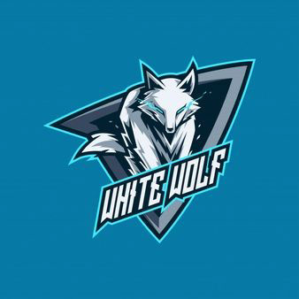
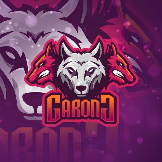
Reference Board



Moodboard
Using the elements from the reference board and keeping aspects of my original design from high school. I tried to recreate the logo with the similarities to reference logos as possible. Taking in elements that are common amongst them. Here are my designs throughout the process.
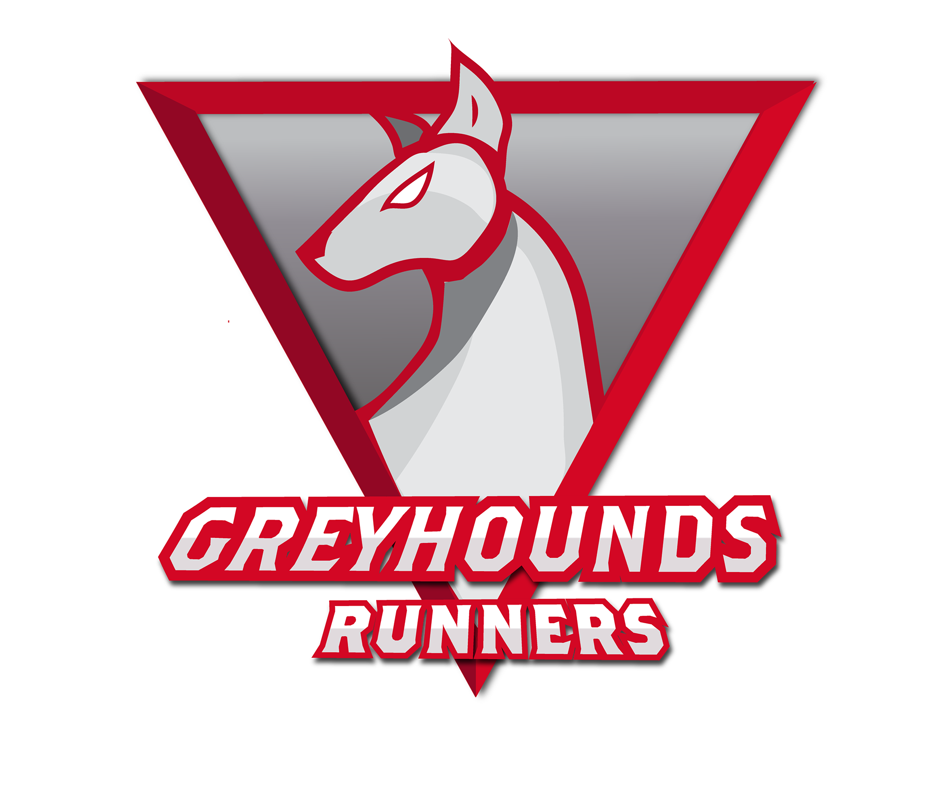
Phase 1 : Design Drafts


PHASE 2: Revising Logos & New Designs
New designs based on Revised Design #1
PHASE 3: Finalized Logo
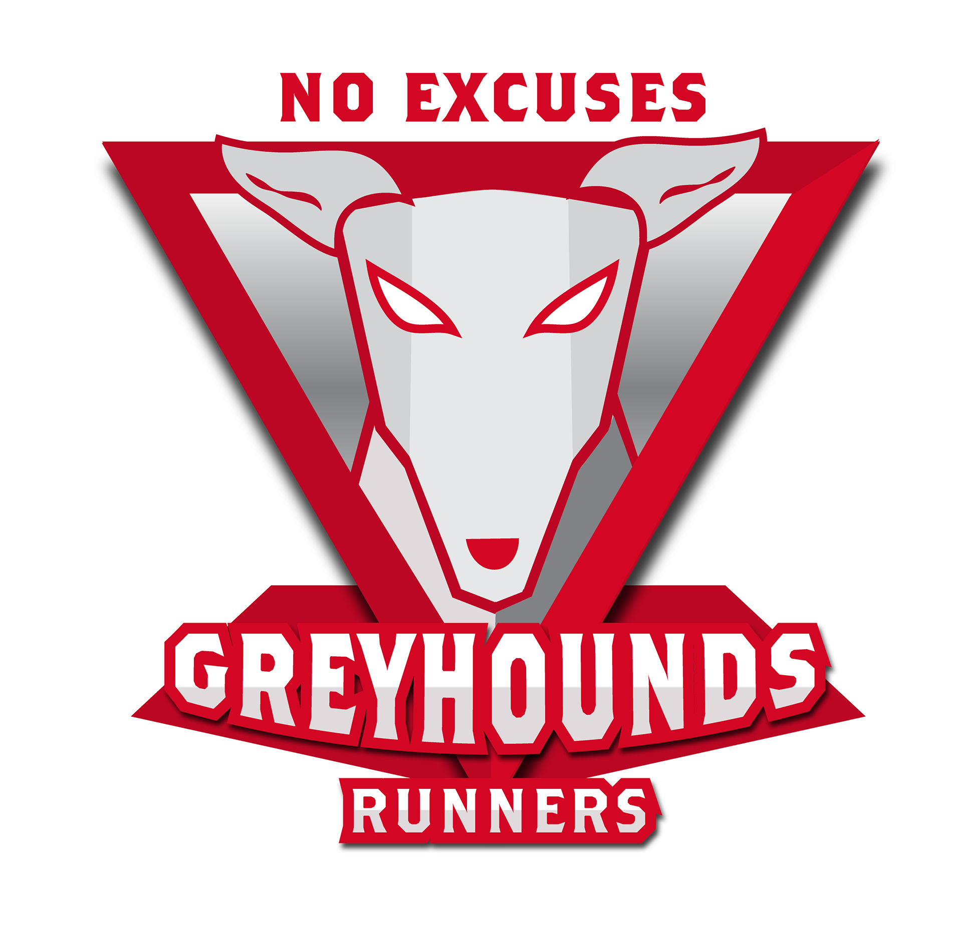
The difference between the Greyhounds logo and other sports logo is that it does not invoke aggressiveness like how football and esports teams' logos are. This logo conveys movement especially running as the main goal of being fit and active for everyone who wants to join. The freedom of movement and being fit.

logo with 'runners'
one with tagline
Apparel: Active Sportswear
Uniforms for special events such as marathons or social gatherings.
Using stock photos from Unsplash and Freepik as to make mockups on display. Using the color scheme I made that fits.